For a Prezi version of this answer click on the following link-Question 7 Prezi
Monday, 10 March 2014
Question 7 - Looking at my preliminary task , what do I feel I have learnt in the progression from that to my full product?
For a Prezi version of this answer click on the following link-Question 7 Prezi
Thursday, 6 March 2014
Question 6- What have I learnt about technologies from the process of constructing this product?
During my time working on my magazine design I have learnt to use a number of programs effectively and adjusted to the various tools each uses. Firstly I had to practise learning how to use photoshop as I had very little experience on the program. I slowly learned how to import images and use the rubber to effectively rub out backgrounds that detracted from the models and crop my images so they were not stretched or out of proportion. I learnt how to increase and decrease the size of images and order the layers I had made so that everything fitted in place and was positioned correctly.
Secondly , I started to use indesign to create my double page spread , attempting to adjust and align the columns and create a title for the article that would relate to the story involved.I tried to use the program in order to showcase the typical conventions of this section of a magazine by including pull quotes and a caption next to the large image of my artist.
Thirdly , I begun to start work using Blogger and found out how to access the photos I had taken in the studio onto the program.I used Blogger to track my progress throughout the design of my magazine by including Youtube videos of the type of bands that I wanted to include within my product. I also began to use an Animoto to storyboard how I could distribute my product.
Finally , I had to use cameras in a studio to take photos of my actor in order to make it seem authentic and believable as a magazine you would find on the shelves of a supermarket or shop. I managed to control the amount of lighting when capturing the images , so it didnt look to light or dark.
Click here to view my PINTEREST technologies board
Wednesday, 5 March 2014
Question 5 -How did I attract/address my audience?
As you can see , in screenshot 1 , I attracted my audience by including younger bands and artists which my target age group could relate to. The red sell lines still 4 are written in capitals to interest the audience further and highlight a key band or artist that they will recognise. The pull quote from the artist , in screenshot 2, featured on the cover helps to entice the audience and make them curious about what the artists personal opinions or views.In the third image , the cover is comprised of elements that were both appropriate for my genre and the audience due to use of colour and representation of the smart well dressed , confident individual , making the audience aspire to be more like them .
screenshot 3 |
screenshot 1 |
screenshot 4 |
screenshot 2 |
Tuesday, 4 March 2014
Question 4- Who would be the audience for my media product?
My audience are mainly males aged aged sixteen to thirty that have a low amount of disposable income and enjoy listening to Indie music .They may spend their time studying at college or going out with friends.They may spend their money on tracks available from iTunes , so it may be an idea to incorporate this with the magazine as I could include vouchers for competitions prizes for example.They may enjoy using recent technology so I could try to possibly make a free website that will widen the popularity of the brand.I think they would like to read my magazine as it will be cheaper than most music magazines , priced at 1.99 , so it will not be over priced and will interest their music tastes with the bands they are most interested in.
To get more responses I linked survey Monkey with Facebook and I think that this made the survey more successful:
For my Survey monkey questionnaire on audience Click here
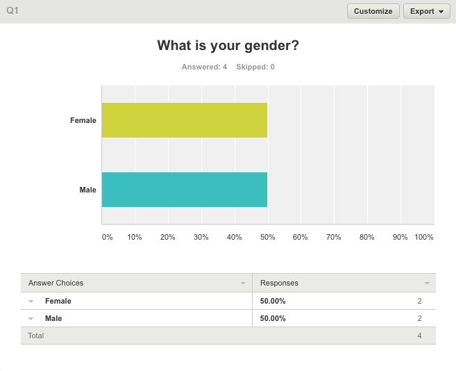
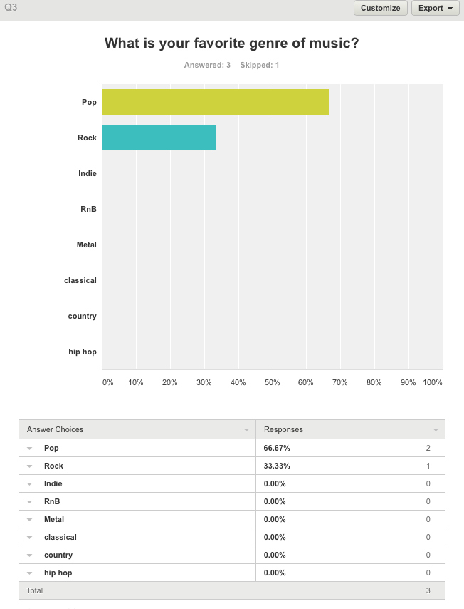
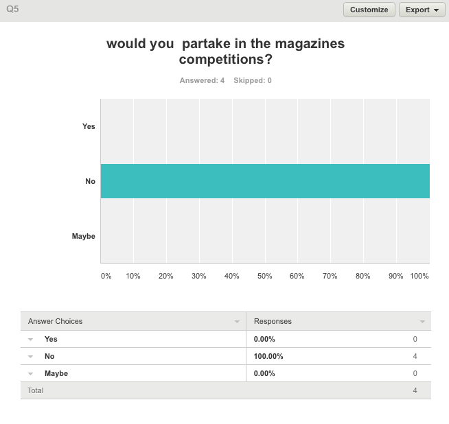
Additionally , to gather some results , I designed a questionnaire on Survey monkey in order to get some unique opinions on music magazines in general.I attempted to find out why music magazines are still very popular and who would want to read Chord, the project I am making. Above is the link the link and below are some screenshots of the survey:
This graph proves that my results are fair as an equal amount of males and females have answered the questions. |
This graph reveals that there is still a huge interest in mainstream pop music , mainly because it is the most accessible to the audience. |
This graph proves that most people would not buy a music magazine out of their own accord and if they did they were not willing to pay a large ammount. |
Overwhelmingly , This is proof that competitions do not interest the general audience , so I will not be including many in my indie magazine. |
Sunday, 16 February 2014
List of resources
Here is a list of resources with hyperlinks I used in my magazine research:
http://www.nme.com/- The official website of NME was an important slurce as it too covers indie music and gave me some of the conventions that should be included with this media format.
http://www.qthemusic.com/ -The official website of Q magazine also shown me the basic magazine layout and allowed me to explore which artists appear often and are popular within the indie genre.
http://www.wikihow.com/Make-a-Magazine - This is a detailed step by step guide in how to make a magazine efficiently and effectively.
http://www.indie-music.com/ee/index.php - This website allowed me to keep updated with indie news that I could apply to my magazine. It is important to keep the magazine modern as it will not be popular with the young audience I have chosen.
Friday, 14 February 2014
Question 3 -What kind of media might distribute my media product and why?
I believe that my magazine would best fit being distributed in shops as this would allow to keep the brand in the publics attention and allow the magazine to continue to be maintain. Being displayed among other magazines may help increase its popularity rather than handing the magazine out for free at venues around the country. Although I could include this as an option the profits of the magazine would entirely be dependent upon advertising revenue whereas there would be a larger income if the magazine was on sale. It could possibly be available as a free app like many other music magazines as technology becomes more advanced and people prefer to view magazines online rather than play for a copy. IPC media publishes NME , a very similar music magazine to my own , that has many brands in its range with amateur gardening , chat , world soccer , yachting monthly.I could consider this as a means of distributing my product to my audience. Below are a few of the publishers wide range of magazines :
An animoto of my magazine research:
Thursday, 13 February 2014
Question 2- How does my media represent particular social groups?
There is a resemblance between my models cover image and the Q cover as they both use direct gaze to connote a certain type of confidence to the audience. The costumes the two men are wearing are very similar in that they are expensive and show their importance. Both backgrounds are pale white as the magazines want the audiences attention to be solely focused on the artist and not elsewhere. Both images include bright lighting so we can see the artist clearly and see their features easily.These two images represent a young social group that care about appearance and will encourage this audience to purchase the magazine. Both of the mens postures are similar as they are both clutching their clothing to project and image of youth that will reflect upon the young experimental males that are exploring the music industry as they grow. The costume , hairstyles and facial expressions let the target audience know that they know they are talented and have confidence in their ability.
Thursday, 6 February 2014
Question 1- In what ways does my media product use, develop or challenge forms and conventions of real media products?
First of all , the title of the magazine will hopefully resonate with the audience I want to focus on as it is associated with musical instruments and the names symplicity highlights the magazines objective of wanting talented bands and artists who have strong talents.My masthead is large and bold so it will hopefully make an impression on the audience in a shop or newsagent.I deliberately chosen a font that suited the style of other magazines such as Q and used capital letters to capture the importance of the magazine so that it will become strong competition for other contemporaries including NME.
This second element is a convention of popular double page spread as it is a pull quote to interest someone flicking through the pages.The written content is it quite formal so people could relate to and connect with the star.I used a small snappy amount of text that has a normal font so it did not detract from the image and title.
The font for "subscribe today!"was enlarged as it is the most important point in the subscription box. The dark red is typical of this genre as it is not as bright or colourful as we love pop for example which is targeted at a much younger audience.This is the main image for my cover and I tried to incorporate mise en scene in order to deliver a message to my audience.The suit the model is wearing suggests the artist has a sense of style and cares about his appearance.This costume connotes confidence and I chose a male model as the genre will probably interest them more. This image is laid out in the centre of the page as it reduces the white space.
Wednesday, 5 February 2014
Looking at students past work
Looking at past students work helped me to reconsider the genre and style for the magazine I was going to create as it gave me new ideas. I also found it helpful to choose what I did like and wasn't so keen on about the various designs and helped me to form opinions , like someone who would be browsing a magazine in a newsagent , on if the conventions were used appropriately to attract me to the design.I liked it how a lot of the work had includes sell lines and mastheads.
Looking at magazines
It is important in magazine design to remember that you must include certain conventions to grab your target audiences attention. The covers above indicate that the use of a bold and large masthead that covers the top of the page helps to give the magazine an identity and unique quality.The size makes us instantly know that this is the title of the magazine.The less interesting information is reduced in size as this will not endearing enough sell the magazine. Also , a main bold image creates a greater impact and is easier for the eye to view.An acceptation to the rule would be the match cover as it is full of images rather than a clear stand out. The sell lines in each margin gives an clear impression of good value for money.Most magazines self consciously attract a specific age group and reflect their audiences opinions and views. This helps them to crete a market for this age group.
Video- looking at magazines
Saturday, 1 February 2014
Final pieces of work
Front cover
I think I made a decent front cover here , with my main image taking up most of the area of the page.The masthead is bold and striking and help to tie the magazine together. It was difficult to get the pieces in the correct proportion.Another major issue I had to contend with was the colors clashing with each other , which I felt was important to correct as an audience needs to be able to interpret the text instantly.
Contents page
With my contents page I tried to be much more creative and modern.I added sub headings and extra information to make the contents look good value for money and filled with features.The most difficult aspect was arranging the shoot because I could not get everyone together at a specific time due to schedules clashing.
Double page spread
Out of all my pieces of work , I think I am most proud of my double page spread. It began very poorly as a project on In Design that was unappealing , but I sonly edited the page to look like something you would find on the highstreet. I re read my work and checked that the punctuation was correct and checked that all my columns were placed with care and attention.
Friday, 17 January 2014
potential problems
The potential problems I may encounter include being unable to gather my actors on a certain time and day. This is a problem as it is difficult to find a studio space when everyone is unavailable.To resolve this , I have decided to persist until I find a time and date that is suitable for everyone. Another issue is my inexperience with Photoshop and InDesign , But all I can do to improve my skills is practise , which I have already begun.
Thursday, 16 January 2014
Teacher feedback
As part of my feedback , I was given some points in which I could improve my cover , contents page and double page spread.
Cover
-Reposition cover image
-Reposition sell lines
Contents page
-The images need cropping
-Add subheadings underneath the sell lines
-Look at kerning as there is too much space
Double page spread
-The page number is too big
-The pages are too text heavy
-The fill quote should be positioned in the centre of the page
-There should be a bigger contrast to text used in the subheading
I took this advice , but mainly concentrated on the contents page and double page spread as I though my cover was the strongest. I went back through the work and readdressed and recreated the two pieces from scratch , making they appear more modern and up to date for audiences. Before the were very plain and lacked any real interesting elements but I think that they have been improved vastly.
Wednesday, 8 January 2014
Double page spread article first draft and how I will improve
It’s a wonderful life
New band explain how they rose to fame
Sleep. Eat. Sing. That is the life of “Golden Age” who have
took the world by storm over the last couple of years with, most recently,
their sell out tour-Who we were. “It all started when we were children. I had
just bought my first guitar and me and my mates were amazed by it. Although, admittedly,
it was a little slow to start, I learned that playing was my passion. I played
every night when I got home from school , and honed my skills until I mastered it,
“Explains lead singer Dean smith ,22, on how he and his friends rose to fame
and established themselves as something special.
Fight the demons
Drummer, Frank Jones, tells us that he “found a way to
channel the pain I was going through in music at some of the most difficult
times in his life. “This was built upon in the emotional number “without you”
on their new album –Growth that stole Coldplay from the top spot of the album
charts. The group have explained that they have had a wild ride since their
humble beginnings in London. They go on to tell us that they originally started
to play in pubs and clubs around the country.
The group explain that they believe that music is a way to
explain the problems people find within their lives and that it’s good to
“express” yourself. They have been compared to the likes of the “arctic
monkeys” but have arguably brought their own style to the genre and turn it on
its head. Whilst the band originally had a negative reaction from Indie fans
they have now found themselves at the pinnacle of their career despite failing to
set the scene afire at the beginning.
Looking to the future
As the group , get set for their fourth studio album , they
state that they want the material to go “darker” and focus on recording very
soon.”we seem to have matured over as time has went on , exspecially after some
tough decisions last year” explains smith when questioned over the future of
the band and what will hold for them.
“Its not about getting a number one “ laughs Alex Jones ,
Franks brother , who is the guitarist in the group.”we love to bring pleasure
to people through our music and its our fans that makes us who we are.We are so
greatful for the support we have been given and warm welcome.Its more than we
could have dreamt of.”During the interview with sound magazine the group exclusively
revealed that they would like to collaborate with other huge names in the
industry and venture out into other genres.”we would love to work with various
artists.The possibilities are endless , but we would love to work with the
likes of Emili Sande or James arthur.We love a challenge and like to push the
boundaries.Its what we do, smirks Dean.”
When commenting on their opinion on gigs the band stated
that”there is nothing like that feeling on a Friday and Saturday night.The week
is nearly over and the crowd are ready to let their hair down.When we go on
stage we get a buzz that is impossible to gain by doing anyhting else. It is
magic.”
No holding back
It is also a known fact that the group dislike streaming or
downloading music , as it has lost that “ wonderful feeling” of walking into a
record shop and buying the “newest release of a band or artist you look up
to”.They think it s a “high” not available on itunes that could “damage the
industry”.When questioned about if they would consider making it crossing the border to america Dean explained
that” were in no rush to go to america. When we do it we want to do it
right.”The leap to America is , of couse , massive and it seems that they are
hppy at the position they are at at te moment. Golden Age love to “ experiment”
in the studio and see what sounds they can create and use.
“Our last gig , was a blast.It seems to get better and
better each time we go on stage and we are not gonna quit doing what we love in
a while yet.” Explains Alex.”Were only just beginning” adds Frank , who
laughs.So it seems that this fantastic band are not going anywhere for a while
yet and we can look forward to a long and enjoyable array of musical
excellence.The talented trio have officially released tickets for “ who we were”
which were made available from yesterday and it is garanteed to be an amzing
experience for fans.After going on hiatus and their music going under the radar
a year ago it looks a sif they have finally found their niche and have found
themselves as a band.
Finally , dean adds “ we hope we can keep feeding the fnas
appetite as we are so grateful to them.We owe them it.”The band end the
interview smiling and are excited about the new prospects and oppertunities
that are open to them in the forseeable future.It looks very bright from for
the London based band and it is astonishing the ammount of record sales they
have sold.We can only hope they continue to make the wonderful music that made
them famous.
What I did well:
With this article I managed to use an interview style to keep the audience interested and engaged.Generally , I had done well to create the illusion that this was in fact a really famous musician.
What I did well:
With this article I managed to use an interview style to keep the audience interested and engaged.Generally , I had done well to create the illusion that this was in fact a really famous musician.
What I need to do to improve:
Subscribe to:
Posts (Atom)