Thursday, 19 December 2013
Friday, 13 December 2013
Choosing the images for my magazine
When shooting material for my three tasks , I took a variety of different shots so I had much to choose from. Here are some of the images I used and some I didn't and my reasoning for including or rejecting it:
 |
| This shot was rejected because it seemed as if the artist was too laidback and it would be difficult to position this image on a double page spread. |
 |
| I decided to use this image for my double page spread as it was a good proportion and used direct gaze to connote confidence towards the audience. |
 |
| This was my cover image because I felt it was similar to that of an NME or Q page in that the artist appeared focused and confident. |
 |
| This image simply was not taken very professionally , being to far way from the camera and taken with the backdrop clearly visible. |
 |
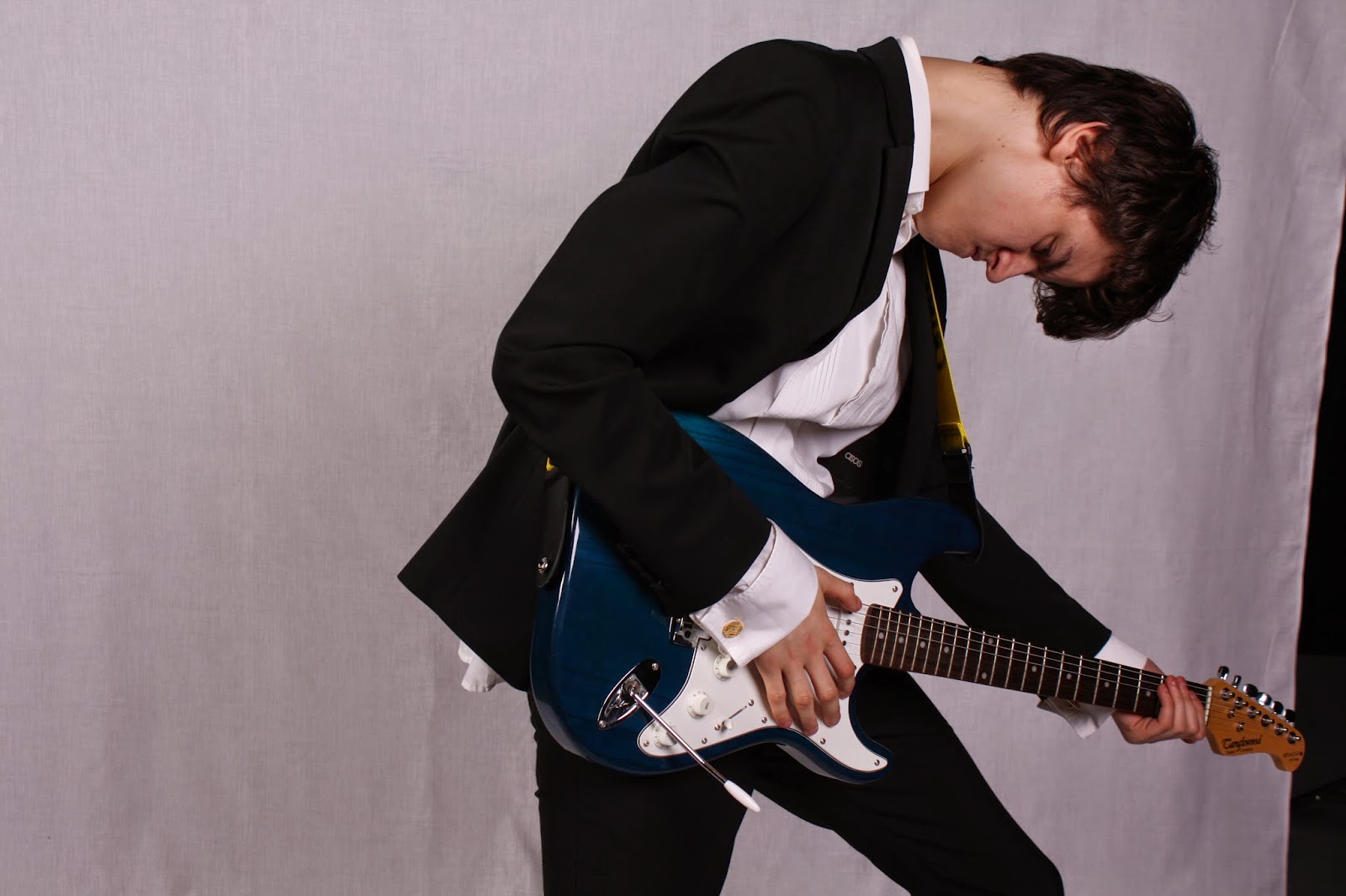
| This image is overdramatic and a bit far fetched to appear in a magazine. It also did not meet my goal of making the artist seem relaxed and confident. |
 |
| This issue with this mid shot is that we can not identify that this is the artist and therefore it will not grab the attention of his fans. |
 |
| I decided against adding this image because my model is not looking at the camera , and therefore it does not involve the audience as much as it could. |
 |
| Again I did not like this image , it was not easy to identity the artist and ultimately the artist should be facing the camera , which I have learnt to do in the future projects. |
Subscribe to:
Comments (Atom)
